Zenco
The design system Soraban runs on: tokens, components and the conventions that hold four products together, built from zero as the sole designer over four years.
When I joined Soraban the product existed, but there was nothing shared underneath it. No variables, no published library, one loose set of color styles applied inconsistently across a UI that had grown organically for a year. Every new feature started from a slightly different set of primitives, and nobody had the authority to decide which was correct.
That's how Zenco, the design system, came to be. It started as a small local set of color variables, and over four years, single-handedly, it grew into the one source of truth for the whole product. This case walks through the decisions that worked, and the one thing I'd change first if I started over.
- 5,148
- Component variants46 UI sets
- 184
- Variablesacross 4 collections
- 23,386
- Bindingsresolved in the audit
- 37
- Doc pagesone per component area
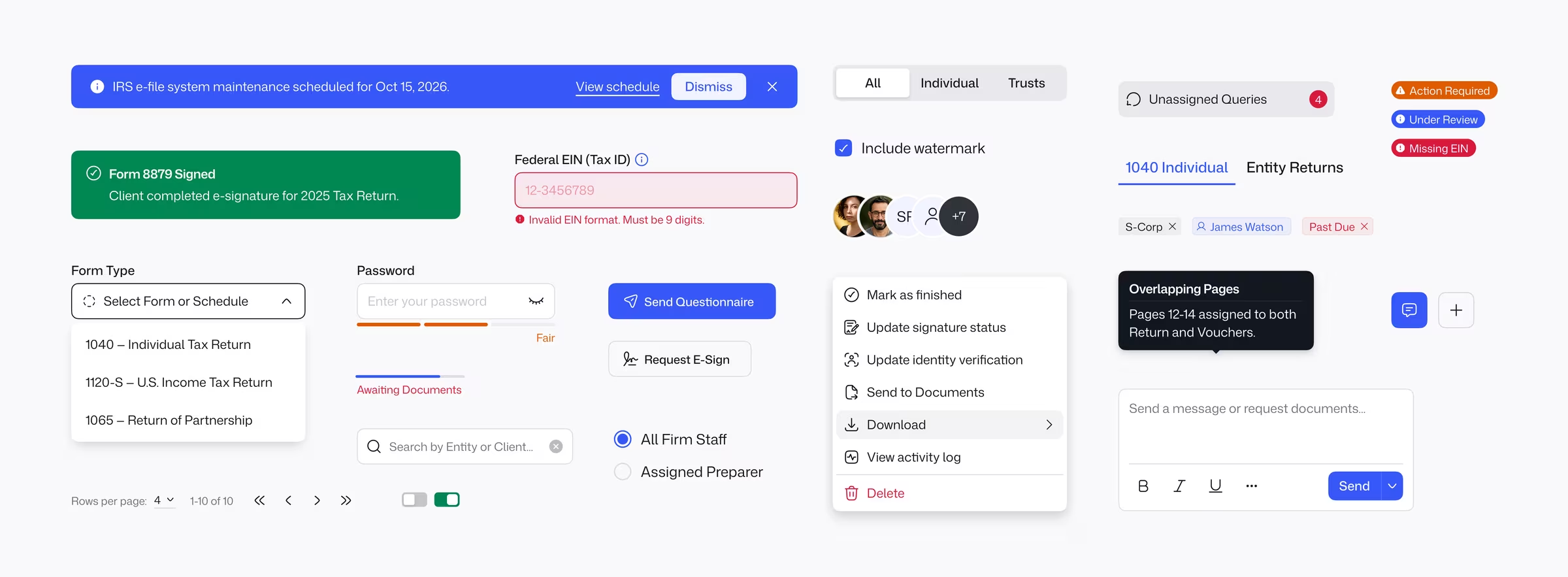
Decision log
A two-tier color chain, and the discipline to never break it
The single decision that shaped everything else was how to structure color. Most systems fall into one of two failure modes. They expose raw palette values to designers, so a rebrand means hunting hex codes across a hundred components. Or they build a semantic layer and then leak past it whenever someone is in a hurry. I wanted a chain where the semantic layer was the only address a component could bind to.
Palette63 raw values, 1 mode
- Blue/Main
- Blue/100
- White/Main
- Black/Main
- Green/Main
Color101 aliased tokens, Light and Dark
- Surface/Accent Blue/Main
- Surface/Accent-Subtle Blue/100
- Surface/Primary White · Black
- Surface/Success Green/Main
Components8,332 bindings, 0 bypass
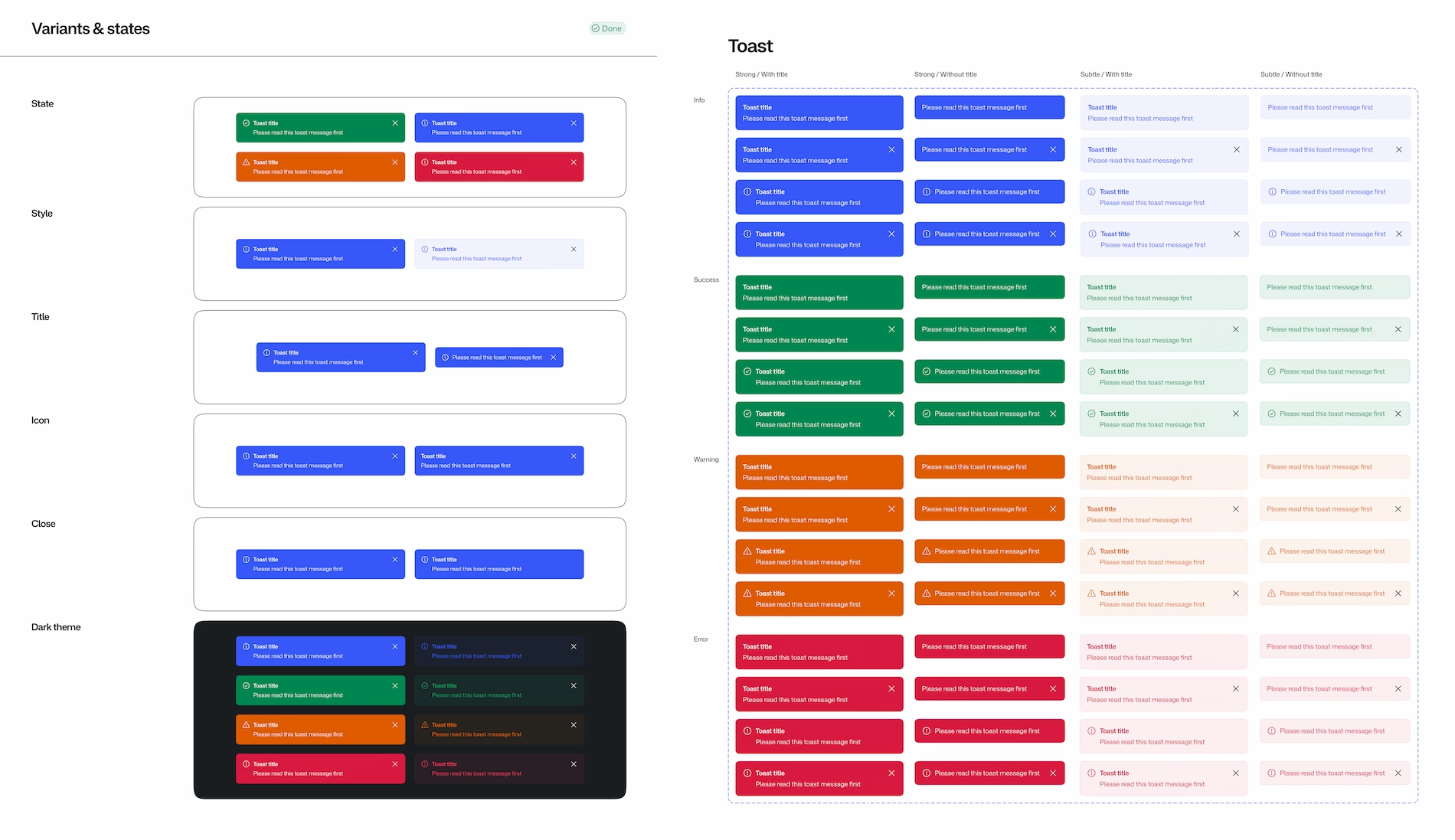
- Toast · Info / Strong
- Toast · Info / Subtle
- Modal surface (Light)
- Toast · Success / Strong
Foundations
Making the wrong token physically unpickable
- Problem
- Systems drift when nothing stops a designer, mid-sprint, from using a text color on a background because the value looks right. The intent of the token is lost the moment it lands on the wrong property.
- Decision
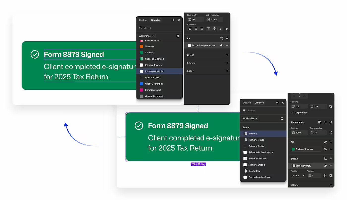
- Every semantic token carries a Figma scope. Text tokens appear only in text-fill pickers, Border only in stroke pickers, Icon only in icon fills, Surface only in frame and shape fills. The picker enforces the taxonomy.
- Outcome
- The “designer used Border/Primary on a background” class of drift stopped being a review conversation. It stopped being possible to make the mistake.
Foundations
Dark mode as a structural property, not a second theme
- Problem
- Dark mode in most systems is a parallel theme built by hand: a second set of tokens shadowing the first, kept in sync by discipline, drifting the moment a new color ships in one and not the other.
- Decision
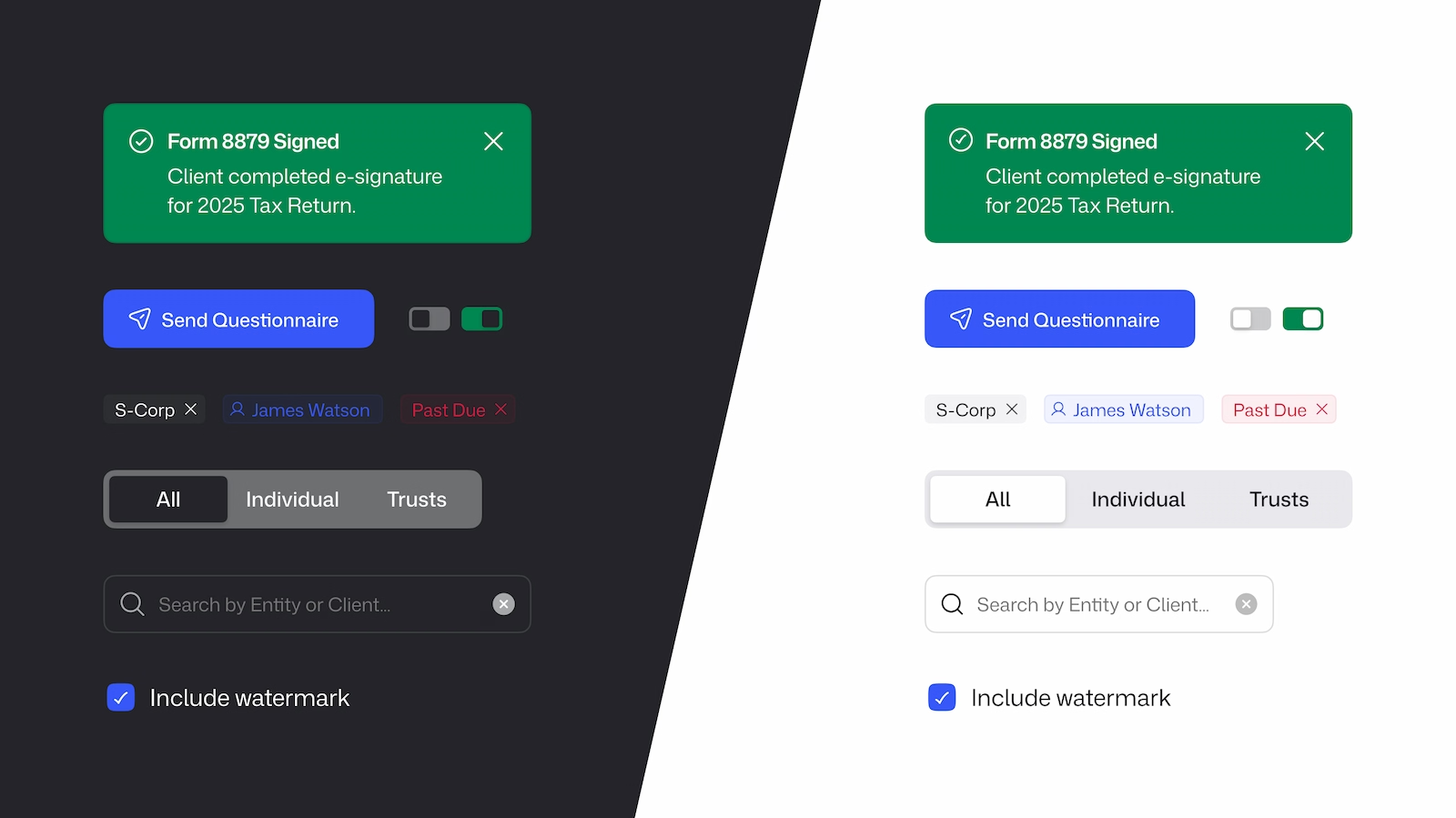
- The Color collection has two modes. All 101 tokens are aliases into Palette with the Dark alias set once per token, so a component built from semantic tokens gets its Dark treatment the moment it lands in a Dark frame.
- Outcome
- No second component set for Dark, no per-screen review of what color becomes what. Adding a semantic token is one action that ships both modes.
Convention
A page template every component gets, without exception
- Problem
- With one designer and no dedicated review time, documentation is the first thing to decay. Components end up documented differently, and after a year nobody, the author included, can find the canonical variant of a master.
- Decision
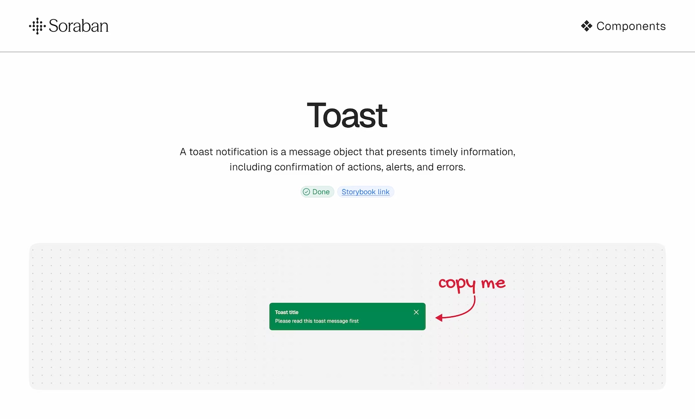
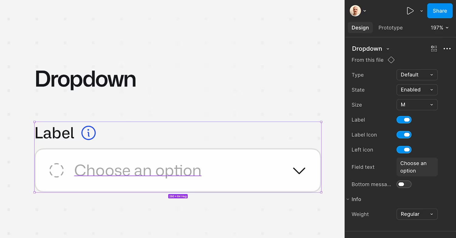
- Every component page follows the same three parts: a Master section holding the source of truth, a Variants and states frame showing the full matrix, and an Overview frame with usage and anatomy. A small set of documentation components makes the template mechanical to apply.
- Outcome
- 26 of 28 component pages follow the template. A component is not done until it has all three parts, so documentation ships with the component instead of trailing it by a month.
Health snapshot
Where the system is mature, and where the trade-offs are
I ran a full architectural audit of the library at the four-year mark, resolving all 23,386 variable bindings back to their sources. The color layer does exactly what it was designed to do. The dimensional layers, spacing and radius and elevation, are behind, and I know why.
- Color token architectureTwo-tier alias chain, 0 of 8,332 bindings bypass the semantic layerA
- Auto-layout adoptionAbout 99% of frames on component pages use auto-layoutA
- Typography98 to 100% style adoption, styles only, no responsive tierA
- Spacing tokens15 primitives, no semantic tier, doubles as the radius scaleB
- Radius as its own layerDoes not exist: 7,894 radius bindings resolve through SpacingD
- Elevation4 effect styles, not variable-backed, cannot mode-switch with DarkC
What I would change first
The one thing I would separate on day one
I would give radius its own token collection from the start. In Zenco every corner radius resolves through the Spacing scale, because early on, when the system was small, one 4/8/12/16 scale was clearly enough for both. It stayed that way as the system grew, and now 7,894 radius bindings point at Spacing tokens.
The practical consequence is that the two visual languages cannot be retuned independently. Retighten the spacing rhythm and the corner radius of every surface in every product moves with it. That is fine with one designer and one product. It becomes a real constraint at four products, and at the point where a design engineering pipeline needs to export tokens to code.
The migration itself is not hard: create a Radius collection, rebind those 7,894 references, keep the pixel values identical. But it has to happen before anyone builds against the exported tokens. In the current architecture it is a lift. In a fresh system it is a first-day decision that costs nothing.
TodayOne scale, two jobs · 15 tokens
- Size/Size-01 2
- Size/Size-03 6
- Size/Size-04 8
- Size/Size-06 16
padding, gap and border-radius all resolve here. 7,894 radius bindings are tied to Spacing, so neither language can be retuned alone.
SeparatedTwo scales, two intents
- space/4 4 px
- space/8 8 px
- radius/sm 4
- radius/full 999
padding and gap resolve through space, border-radius through radius. The two languages retune independently.
Zenco was built alongside the product, not for it. The system and the redesign of Soraban happened over the same four years, by the same person, each informing the other. What worked in the system shaped what shipped in the product, and what broke in the product got fixed by adding to the system.
Numbers throughout this case come from that same audit.